
I hate menus
Menus are not something the player spends too much time considering. They are, after all, simply a way of delivering the dense information that is required for the actual game— you know, the fun bits.
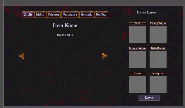
One thing a player definitely does notice however, is a bad menu. I know this because I play plenty of bad indie— and some not so indie— games, at least on the UI front. Bad menus completely take you out of the immersion of a game and are very easy to notice, since there isn’t much else going on on—screen in the moment. Thusly, I have spent 3 days trying to make a menu look nice. Specifically the loadout—selection menu, which is the template for the rest of the menus in Dungeons of Damocles. I wish I’d taken in—progress screenshots so you could understand just how ugly it all really was.
Eventually, I drew inspiration from the Payday 2 loading screen— sans heist—map. I like the way all the loadout bits are shown in that. I know my design doesn’t look much similar, so you’ll just have to believe me.
Most of the actual buttons and things are from an asset pack I bought — I tried pixel art once many years ago and decided it was best for everyone if I didn’t return!
Most frustratingly, it still isn’t bloody finished! I’ve still got a lot of empty space and not much to do with it. I also need to show the buffs and debuffs of each item in the blank area— once I decide what they actually are!
With all that ranting over, I think it’s best I get back to my menus…
Turrah,
Ben
Most of the assets in this menu are from an asset pack: https://www.gamedevmarket.net/asset/gothic-ui